Author | Agility | Artificial Intelligence | Data Ethics
As explained in my previous post, "Data Science Storytelling," A compelling story is more than just a chronology of events. If you present a narrative of your uneventful trip to the grocery store to buy a gallon of milk, your audience will begin nodding off long before you reach the part about waiting in line to check out. For a story to capture and hold the audience's attention, it certainly needs a narrative data storytelling structure. That includes characters, setting, conflict, and resolution.
Likewise, the data story you tell an audience requires more than just data and visualizations. The data is only one essential element. As I explain in my previous post, you need to tell a story with that data that engages, entertains, educates, and transforms the audience — a story that changes how the people in your organization think or changes what they do or how they do it.
However, in my previous post, I stopped short of providing any guidance on how to build an effective story. This post is the first in a series that provides detailed instruction on how to compose an effective data story. Here, you discover the basics of structuring your story.
Basic Story Structure: Beginning, Middle, and End
Every story has a beginning, a middle, and an end, and each part of the story has a different purpose. When structuring your story, be sure that each part of the story fulfills its purpose, as explained in the following sections.
Beginning: Establish the Context
At the very beginning of the story, establish the context by introducing the characters (people involved) and the setting (where the story takes place). For example, "We've been closely monitoring customers who purchase shoes on our website. We can see where they live and connect that to how often they place an order.” The characters are customers and the members of the data science team. The setting is the website where the customers shop. This provides a context for the rest of the story.
Tip: Establish the context as quickly as possible. If you take too long (a common mistake), the audience will begin to lose interest.
Middle: Present the Conflict and Research
The longest part of the story is the middle, in which you introduce the conflict and the research performed to resolve the conflict, but stop short of the actual conflict resolution. For example, “Customers in urban areas are more likely to buy running shoes. In fact, the more densely populated the area the more shoes they buy. We thought this was strange. As runners ourselves, we don't really like running in densely populated areas because of the traffic and pollution."
The conflict draws in the audience by introducing a mystery that needs to be solved. The research lead even used a personal anecdote to stimulate curiosity.
Presenting the conflict segues into the research conducted to resolve the conflict or, in this case, solve the mystery. Here's where the team explains where it looked for the data and describes the data and analytics and any experiments the team performed.
Tip: Don't provide too much detail — let your data visualizations do that. For example, you might say, "We noticed that customers in urban areas tend to be younger, but even after adjusting for age, we found a pretty big discrepancy in purchase volume between urban and rural customers. We also looked at some maps where we had a lot of active customers. We wanted to see if there were more runners’ paths within the city, but we were surprised to see more and nicer paths outside the city.”
Notice how the team draws the audience into the mystery while introducing the research and analytics it performed.
End: Resolve the Conflict
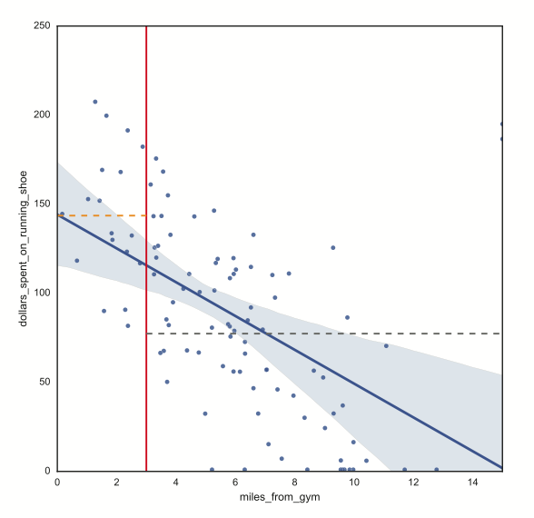
At the end of the story, you deliver the big reveal and possibly a call to action. To continue with our running shoes example, the team may end with something like, "It turns out that the strongest connection we found was that customers who lived within three miles of a gym bought more running shoes."
The orange dash line shows average dollars spent on running shoes by customers living closer than three miles from gym versus the grey dash line showing average dollars spent on running shoes by those living farther than three miles from gym.
The team may then present a call to action; for example, "According to our research and analytics, we need to do a better job of promoting our shoes through gyms in urban areas." Or, the team could get the audience involved by challenging audience members to recommend ways to capitalize on the information and insight.
Choosing a Plot
Although a story structure with a beginning, middle, and end is a good start, it's too basic for figuring out how to structure a story that holds the audience's attention. Fortunately, storytellers throughout history have come up with story-telling formulas that work. In his book The Seven Basic Plots, Christopher Booker argues that interesting stories have seven patterns. When structuring your story, you would be wise to choose from one of the following seven plots:
Rags to riches: A “nobody” who's penniless and powerless achieves wealth, power, and fame. This is a great choice if you're recommending a strategy and want the audience to envision the success the organization might achieve by implementing it.
Overcoming the monster: An individual or organization faces a daunting challenge or competitor and achieves victory. This plot type is useful for presenting a recommendation that may help the organization respond effectively to a competitor or a competing product.
The quest: Take the audience on a journey to discover knowledge, insight, or something else of value. For example, if you set up a mystery at the beginning of your story, the quest involves solving that mystery. You can even involve the audience in the quest by asking audience members questions and welcoming their participation.
Voyage and return: The main character travels to strange lands, experiences new things, and returns to reflect upon what was learned. This plot is an excellent choice for presenting data science experiments or organizational initiatives that have failed — the organization or an individual or team tried and failed but learned an important lesson.
Comedy: Something (typically an argument or confusion) gets in the way of characters who are destined to be together, but they end up together at the end. This plot could be useful for presenting instances when two teams or individuals disagree but resolve their differences in some way that is beneficial for the organization.
Tragedy: Essentially the opposite of rags to riches, a change of fortune leads a team, individual, or organization to ruin (or failure). Tragedy is the plot of choice when a team or the organization experiences failure and needs to learn from it.
Rebirth: The main character falls under the influence of a dark power and redeems himself or herself at the end. This plot is a good choice for introducing a big change that's coming to the organization or team or a change that needs to be made. For example, a company that's struggling may choose to completely change its business model, as IBM did years ago when it moved from low-margin PC and hardware sales to a higher margin service and consulting business.
Keep these plots in mind as you tell your data science story. As a storyteller, these plots help define exactly what you're trying to communicate.
“Data scientist” is more difficult to define than terms used to describe other scientists, such as chemist, biologist, geneticist, or meteorologist. Part of the problem may be due to the fact that “data science” became a commonly used term long before data science became a formal field of study. Even now people who call themselves […]
Artificial intelligence and organizations don't always fit together. To get the most from an AI initiative the leaders need to encourage creative questioning.